


Hexagons – Start With Why


The Reasons Behind the Hexagon Hype
Introduction
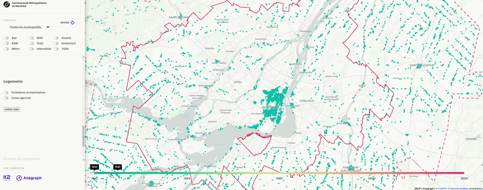
You have probably seen some cools maps fly by that made used of hexagons instead of other grid systems to represent continuous and discrete data. We have used hexagons for use cases as varied as site selection for the Toledo bakery and representing the mean year of construction of buildings in Greater Montreal.
Many articles explain the technical details around hexagons but few focus on the reasons that led to their popularity. In this article, we will cover the backstory of the problems behind the creation of hexagons at Uber, zoom out to the generalization of the problems in a geospatial context and zoom back to an applied example in real estate. Finally, we will give an overview of our tools for working with hexagons.
The Backstory
You probably heard of some of the stories and complaints around the Uber variable pricing model. The press in Montreal was quite adamant to talk about them in the context of rising tensions with local cab drivers. Uber even officially changed its pricing strategy in Quebec. The logic behind the variable pricing model is based on a business decision at Uber: running out of available drivers is a catastrophe. Interestingly enough, it is because of issues with the variable pricing model that they ended up creating H3 grid cells.
The information used in this backstory comes from Uber’s presentation on H3 Hexagons. If you haven’t come across their engineering blog, it’s filled with some awesome material and is definitely worth looking into.
First Problem: Edge Effects
The first problem was what Uber calls an edge effect: Users located in a lower-cost region at the edge of a higher region would experience longer wait times. The drivers were incentivized to wait for new customers in the high-paying region instead of picking up the waiting customer. The variable pricing model led to surge cliffs where users of Uber outside of a surge area would wait significantly longer to be picked up by a driver compared to a user near their location but within the surge area.
Second Problem: Phantom Demand
The second problem was what Uber called phantom demand. Drivers would wait in a high-cost region for users to demand a ride near them while a very punctual event was driving all the demand in the region at the other extremity of the region. Drivers are unintentionally guided to wait within a surge area because they believe the demand is distributed uniformly within the area.
Third Problem: Boundary Management
An obvious solution to the two previous problems is simply trying to break down the problematic boundaries into smaller boundaries. Although this solution can work, its hidden cost is enormous for two reasons:
- The segmented polygons need to be manually created
- The segmented polygons will need to be revised periodically
Significant costs and risks can be experienced when working with applications at scale. Of course, there is the cost of manual data creation but there is also the risk with the associated quality insurance of the boundaries through time.
The Solution: Hexagons
Uber’s answer is that a grid system represents local variations in a more coherent manner. Most spatial phenomena are not discrete and do not follow clear-cut administrative boundaries. It is a kind of a comeback to the premise of using raster data formats for spatial analysis of the old days.
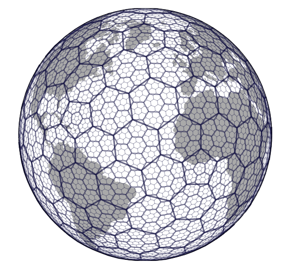
H3 Key Characteristics
- 122 base cells
- 12 pentagons introduced because you cannot unfold an icosahedron with only hexagons
- 16 different resolutions
- Child cells can be easily truncated to find their ancestor coarser cell, which enables indexing
You can read about Uber’s reasoning behind the choice of hexagons here. The TL;DR is that there are 3 reasons that led to choosing hexagons:
- Ability to perform neighbor traversal efficiently
- Subdivision of the grid system
- Minimization of distortion
There are only 3 shapes that can be used to tesselate a surface: triangles, squares, and hexagons. Triangles have 12 different types of neighbors making it difficult to perform neighbor traversal and the grid can be difficultly subdivided. On the other hand, squares can be perfectly subdivided and they provide decent neighbor traversal even with the fact that they have two different kinds of neighbors. Hexagons have a single type of neighbor making traversal easier. They also suffer from less significant distortion. However, they cannot be perfectly subdivided. Uber introduced an offset in response to the subdivision limitation.
Beyond Uber — An Application of Hexagons to Real Estate
Uber’s presentation of H3 stirred a lot of conversations at Anagraph. Finding the right geospatial boundary solution to aggregate data is a non-trivial problem.
The first thing you should consider is whether you need to aggregate your data to answer your business need.
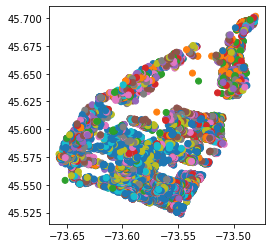
You should not aggregate your data regardless of the boundary used if your phenomenon can be accurately represented without using a choropleth. That being said, many applications require aggregation to avoid visual saturation. For example, consider thousands of properties for sale in a given area:
The underlying problem behind phantom demand and edge effects is using boundaries where the aggregated data is not distributed uniformly in the area.
Phantom demand and edge effects are created for any problem, regardless of the specific vertical, where the use of a boundary misrepresents local variations which eventually leads to misinterpretation of the data from the end-user. There will always be some local variations that cannot be represented when aggregating data. However, some boundaries can minimize misrepresentations.
We aggregated the properties dataset in East Montreal to the quartiers sociologiques of Montreal:
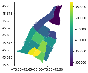
Notice aggregated analysis of property prices using boroughs is common practice. We believe it can be a misleading one. A potential buyer considering the above image could be influenced to think that property within a neighborhood would be a good investment while it is not. More on this in the section back to the business case.
Choosing a Hexagon Size
Two statements should be confirmed before comparing different hexagon sizes:
- We need to aggregate our data for it to be represented
- Typical administrative (or other) boundaries do not represent the local spatial variations
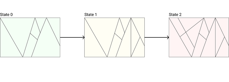
Choosing the right spatial boundary for a given problem is non-trivial. You might be tempted to just test out different hexagon resolutions and intuitively decide which one feels right. You probably will come up with some intuitive notion of the resolution to use based on your datasets characteristics and the available H3 resolutions. In most cases that is probably fine, but it is an approach that is harder to back up with evidence.
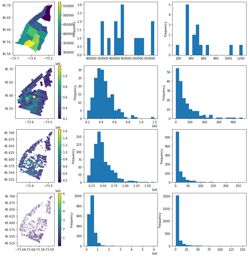
Our solution has refined from the one above over time. We like to visually inspect how the results look and feel while displaying other statistical information such as a histogram or spatial autocorrelation.
We compared the prices of properties of different spatial boundaries using the map images (left), their corresponding price (center), and count (right) histograms.
(Some) Technical Points
Going from the visualization to an actual decision on how to represent the data entails many factors. There are many takeaways from the above figure and we could go much further down the rabbit hole. However, there are some key takeaways:
- The borough representation varies significantly from the hexagon representations
- The sample size of the borough histogram is very low which explains its choppiness
- The r9 and r10 resolutions cover significantly less area
- The r10 resolution and count histograms start to be highly skewed to a point where the sample size within individual hexagons is likely too limited to be interesting
We could refine our analysis by applying some preprocessing steps. Perhaps the median price could be used to limit the outliers within a boundary to influence its displayed central price. Similarly, outliers could be filtered prior to the analysis for the same reasons.
More generally, the r8 and r9 results (center rows) would probably be considered the most interesting boundaries for aggregating our point data. The r8 boundary could be favored over the r9 for its greater coverage which produces a more complete visual effect. The r9 resolution could be favored if we wanted to carry out a finer grain analysis or potentially join other datasets.
Back to Our Business Case
Directly using the points, as pointed in the saturated dot map, makes sense-making impossible. The goal of representing aggregated properties onto a choropleth is two-fold:
- First-order effects: Understanding where a phenomenon is situated in space
- Second-order effects: Understanding how a phenomenon interacts with its neighbors
The boundary we choose to aggregate properties is key for both first and second-order effects.
Edge Effects in Real Estate
The generalization of the edge effect in real estate would be the result of having a property situated around multiple boundary divisions be associated with a boundary that does not share its characteristics. In our analysis, this characteristic is price.
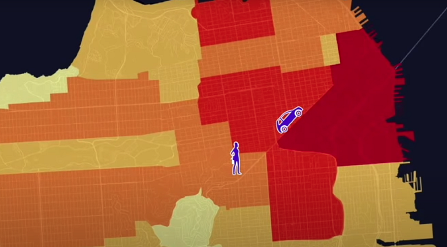
Let’s consider that we are representing the properties using the borough boundaries and that we are a developer considering investing in the property represented by the red point:

The property has a high price (it is red after all) yet it is situated within a lower average price boundary. We might tend to think as a developer that the property is an outlier when in reality it may very well be within a local hot cluster uncaught by our coarse representation.
It is a rather trivial example but the gist of it is there. Notice the same could apply to lower value properties within a hot average price boundary:

Phantom Demand in Real Estate
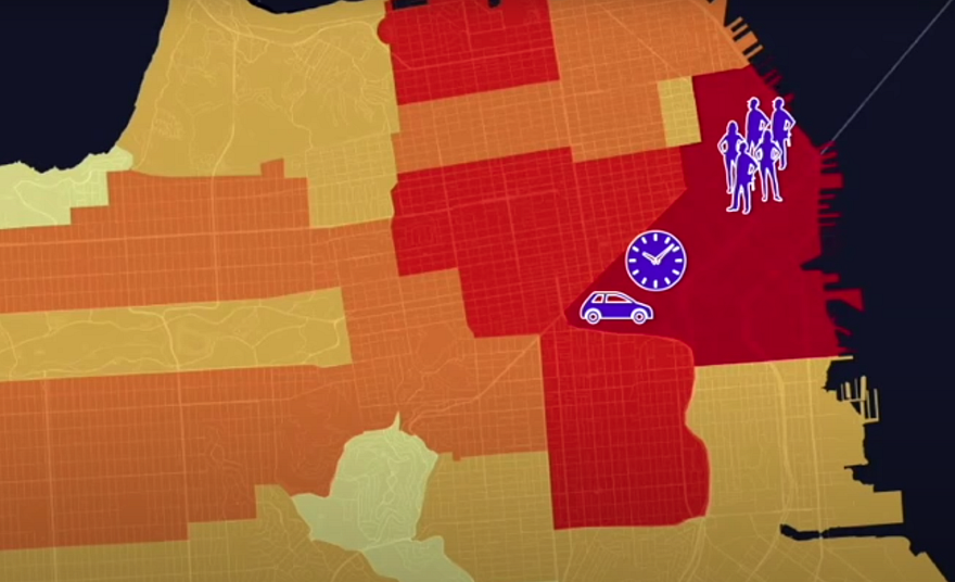
The generalization of the phantom demand in real estate would be believing that all properties within a given boundary relatively share the same characteristics such as price. An interesting concrete problem would be trying to base an opportunity to invest in a property on the fact that a property value is low compared to the average of the given boundary. If the wrong boundaries are used, such as the boroughs, these can lead to some wrong suggestions. Consider the following scenario where the blue point is the “opportunity deal” we want to invest in:

By using the coarse boundary division, we can miss the fact that the high average price is actually driven by a point cluster at the other end of the boundary. It is quite possible that our “opportunity deal” would actually belong in a lower average price cluster.
Under the Hood of our Analysis
We are big fans of PostGIS and the easiest way we have found to integrate hexagons into our work at scale has been using the Postgres H3 bindings.
With these bindings we can create hexagons using queries like the following:
create table hex_r8 as (
  with envelope as (
        select st_envelope(wkb_geometry) geom from    quartiers_sociologiques
    ), h3_id as (
        select h3_polyfill(geom, 8) id from envelope
    )
    select id, st_setsrid(h3_h3index_to_geoboundary(id), 4326) geom from h3_id
  );
https://gist.github.com/zacharyDez/1f96fc71dcfa7216dcf524cc9375cce8
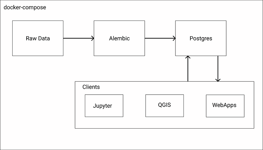
We’ve experienced some difficulties in the past configuring an automated build of the bindings with PostGIS but we now have a docker image that is easily integrated into our local development environments with docker-compose and our production environments with Kubernetes.
For most of our projects, we use the structure presented below. We use open-source tools like gdal, ogr, and sqlalchemy to create efficient and highly scalable ETLs.
We then integrate these workflows within our migration tool: Alembic. Alembic allows us to have replicable database states between developers and separate production from testing environments. The Postgres service initializes the database, creates the necessary user roles, and adds our PostGIS and H3 binding extensions.
Finally, depending on the given task and analyst, the client used to connect to the database will vary. The clients in the diagram are only examples. We have worked with the ESRI suite and Google Data Studio.
In this case, we generated the different graphs in a Jupyter Notebook using Geopandas and psycopg2 to generate a dataframe from our different SQL queries:
from sqlalchemy import create_engine
import psycopg2

conn = psycopg2.connect("postgres://postgres:mypassword@db:5432/postgres")
sql = """with q as (
            select q.id, q.Q_socio, st_setsrid(q.wkb_geometry, 4326) geom from quartiers_sociologiques q
        ), p as (
            select st_setsrid(wkb_geometry, 4326) geom, price from sqfeet_properties as p
        )
        select q.id, q.Q_socio, q.geom, sum(p.price) sum_price from q, p
        where q.geom && p.geom and st_intersects(q.geom, p.geom)
        group by q.id, q.Q_socio, q.geom
        """
df = geopandas.GeoDataFrame.from_postgis(sql, conn, geom_col="geom")
df.plot("sum_price", legend="True")
https://gist.github.com/zacharyDez/ca49eaea85ecc8cb526d879ccd8405ad
Conclusion
We have been working through the reasoning behind using hexagons. Our thoughts are still in progress but we feel that hexagons can solve common problems with data aggregation.
The example above, though important, was relatively simple. The fact being that aggregating point data is simpler than aggregating polygons or lines. We would like to present some of our work on different options when it comes to aggregating nonpoint data in our next articles. More specifically, we look forward to presenting the built-up index that allows us to map census data more efficiently onto hexagons and how we use hexagons as the common boundary on which to map multiple datasets.
We are here for you at Anagraph. We focus our work on building products customer love but we also get involved with system integration. If you need help integrating the Postgres H3 bindings, setting up automated data migrations, setting up a development environment with PostGIS, Jupyter, and GDAL, or even refactoring your legacy code for deployment, give us a call or send us an email: info@anagraph.io, www.anagraph.io.
Feel free to reach out with any questions or comments on the analysis.